Friday 28 April 2017

Evaluation Q7

How do you think you have progressed from you r preliminary task?

Looking back at my preliminary task, I feel that I have learnt the basic essential skills from Photoshop that aided me in creating my magazine production. I this transition I think I have gotten quicker at selecting the right tools to use in Photoshop, and got better co-ordination and prediction skills to determine how to layout my magazine product. I also think I have progressed in removing the background of an image as I do it much quicker now. I have now gotten better at determining which colours go best with the background I have created, I can predict the size of the canvas in Photoshop better and no longer have to try again or edit it to correct size I have made a basic size of page which is 2250 pixels in height and 1500 in width. Comparing to the preliminary task and the final product you can see that my skills have progressed from being a beginner in Photoshop and i am now able to do more things in Photoshop. I have used layers to apply a background which I made and transfer the models image onto it along with the masthead and blend it in and create more effects for a neater finish, I used the layers to make somethings stand out more, In the final media product I made more use of the lighting and vibrance adjustment layer so the rest of the features weren't lost in the background so you get the clarity you see on the front page than on the preliminary task                                                                                                              
       

As you can see that my skills have progressed from using an image with a background to being able to transfer an image to a prepared background and adjust the colours to fit and adjusting the layers to fit into a more unique design. I am able to adjust the cover lines to fit in with the background and colour scheme and create shapes for text that look conventional and professional without just copying a logo to put onto the front page. I have created my own logo in the background whereas in the other one I looked up a PNG and used that. I used a Camera with larger portrait lense to capture the image I have for my magazine cover. The camera I used for the preliminary task was a smaller canon powershot.

Evaluation Q6

What technologies have you used and what have you learnt?

The technology software I used to construct my media product, the music magazine was a programme called Adobe Photoshop CS6, I have learnt many skills in this process on how to use Photoshop to get the desired effects I want. I learnt how to create a background using the paint bucket tool, then creating a gradient by going onto the gradient tool and choosing the one I wanted. The other skills involve firstly using the clicker tool to select, then removing a background with either the background eraser or the lasso tool to cut away at the undesired parts in order to blend the model into the chosen background. I found when I removed the background out of the photographs the edges of the model were very rigid ,so I selected the image and went onto the select bar at the top and went onto refine edge to smooth out and fade the models image into the background. I learnt how to colour correct with the colour replacement tool to get rid of colours which didn’t look right with the background a particular problem with the image I had before I edited it was that the colour balance had too much orange so I used this tool to even out the colours after I used the curves adjuster. I did this with the eyedropper to select the tone from the skin originally then brushed over to correct. I also used the colour correct option to adjust hues without having to go to the curves graph to do it. I learnt to use a clipping mask to protect the colours I didn’t want corrected like the skin tone when I got it right. I used the order of the list of layers, to make everything appear in front or at the back of the model by moving the layers to the correct order on the list. I learnt how to insert and edit text then make it the size and shape needed with the font and size bar, then I went onto the characters tab and found different options to make the text bold or italic. I have found that Photoshop is a highly complex programme that can do a lot of interesting edits such as corrections, swaps.
To take the pictures I used a digital camera specifically a Canon power shot 360, I used this camera because it had a good portrait lense whereas the other choices such as my Samsung galaxy didn't have as high resolution. When I uploaded the images with a USB lead, I saved them as Jpeg's and cropped out the unnecessary parts in the images to get portrait eye level shots before I imported them into Photoshop.


Evaluation Q5

                     How did I approach my target audience?

In order to attract my target audience I used many different features and techniques that I found from my research, which was the survey and the analyzing of other magazines.
I used a certain layout to make sure my magazine was eye catching to the readers, such as putting the masthead at the top, so it’s the first thing they see, then put the main cover line beneath her head to show people the main content was about her, with the rest I put them lower down but not so people wouldn’t recognize them so they understood the main focus. I made my model large by enlarging her so she took up most of the page so it seemed as everything was revolving round her, she was dressed in clothes that were appealing to rock and I made her large in a portrait shot to make sure that the people who were into rock were drawn to the magazine as teenagers and young people don’t always have large attention spans.


I arranged the colours in a certain way to show the readers the genre and significance of certain pieces of content on the magazine. For example I used the colour red to ensure that the main cover line was seen first and to show that it was more significant than the rest, the colour red shows energy, danger and rebelliousness which were the main themes that attracted people who were interested in the rock/metal genre which attracts teenagers mostly. I used blue as the background to make the models features and the text on the pages stand out, also to represent the easy going and carefree nature to the rock genre, therefore attracting my target audience. I used black as the colour for my mast head to make it block stand out against the background so people recognize it as an individual brand. I made the other cover lines different colours that were less easily recognized than but easily noticed by the reader so they wouldn’t be lost in the background.

The font types and sizes I used influenced the readers to stay interested on the magazine, for example I used the largest font for the masthead to show significance, I also used a broken glass type of font to appeal to my teenage audience and this is large to make it easily noticed by the reader. I made my main cover line the largest so it would be more significant to the reader and make them interested in it as it is bigger than the rest of them, I adjusted the size of the font so it wasn’t too small to read or to big that it would drown out the rest and keep the attention on the main subjects. I used simpler fonts for the main body text and the cover lines so it would be easy to perceive and read.

Evaluation Q4

                      How did I attract my target audience?

The target audience for my media product is young people specifically teenagers and young adults aged between 14-35, individualists and people who are largely interested and influenced by rock music, the research in different areas has helped me largely in the production in order to decide this. The research I did was a survey and analysis of magazines based on elements.
One piece of research I have done is analyzing different magazines from all different genres based on codes and conventions, font types, genre. These have helped me realize what exactly people are drawn to when it comes to a music magazine, as I took apart the magazines I had using the microelements and pieced together the information to discover how a magazine uses its features to attract a certain target audience in the media. I have realized that some font types and colours are better for certain genres to appeal to the target audience of whom they are sought after by. For example pink, orange and blue may look good on pop magazines so possibly attracts mainstreamers from the media, or another feature sought after by mainstreamers on the model could possibly be trendy clothes that are in season of that issue. Or rock genre may have colours such as black, red, orange and blue to attract people who are interested in that genre of music. I did this research to see what people look for in a magazine and what catches peoples eyes specifically so I could make my magazine product the same. I also found out new an different things I could put on a magazine to make it more noticeable.


I made a survey to find out peoples preferences in my local area so I could find out what features appeal to the many people in my local area, such as price and economic group, genre, popular clothing choices, how often they listen to music, buy or read a music magazine. These have helped me decide that my model should be youthful as well as the clothing choices by the model, I found out that the most popular choice of genre in my local area survey results was rock/metal music and   the genre was a big part of my magazine because of this research my magazine contains content that is of the rock genre such as colour, model, dialogue, clothing etc. This gave me an idea of what to base my magazine on in general with these results I analyzed them and saw which ones people preferred or liked the most I then included it in my finished magazine product. I posted the survey out on social media such as Facebook and sent it to people via email and Whats App and collected the results as charts for each question on survey monkey.com. I also used social media as a lot of people aged 14-35 use social media so I could find out what my target audience liked specifically by directly targeting them where they would most likely be, possibly making the media product more enjoyable at the fact that they had a say it in.

Heres a link to the survey I used:
https://www.surveymonkey.co.uk/r/38DTXXP

Monday 24 April 2017

Evaluation Q3

                   What media institution should I use and why?

https://prezi.com/1yfupdehj4i0/what-media-institution-should-i-use-and-why/

This is the link to my Question 3 prezi presentation

Evaluation Q2

How does my media product represent particular social groups?

https://prezi.com/lmuovwgyhout/untitled-prezi/

This is the link to my prezi presentation that shows the second part of the evaluation

Wednesday 19 April 2017

Evaluation Q1

How does your media product develop or challenge codes and conventions?

My media product, which is a magazine based on the rock genre has used codes and conventions to make it easy to read and understand. I have used these to create a standard magazine that can be sold by a retailer.  

On my cover page I have used these codes and conventions portrayed here to show that it is about rock in particular, these conventions draw in my target audience especially, for example my target audience is teenagers and younger adults, so I made the genre rock as it was popular and it is a boisterous genre much like youth, I used the colour red on the main cover-line to also show energy and youthfulness in order to be conventional to the genre. The masthead is in big bold black font and is called “impact” to show liveliness and to describe the attributes of rock music so it’s the first thing people think of. The masthead is at the top so its easily noticed by customers, the model takes up the page to show significance and fluentness. The barcode, price and date line on the bottom shows that its able to be retailed, the masthead is in unique font to show house style and individuality.
On my double page spread I have used codes and conventions to give it the appearance of a standard double page spread for example I have included the colour blue, white and black to show consistent house style, I have also used the same model to continue the genre and the style throughout. The model is on the left side making it conventional and easy to read, the article writing is on the bottom of the page like most rock music articles I have seen so it doesn’t look to busy, the heading “behind the scenes” is the main focus of the page so is in white and at the top to stand out and clearly show the reader what its about. The models expression shows wildness and youth, these attributes are also associated with rock showing typical body language and personality of the people from that genre its in, the title is titled adding a boisterous effect to it once again continuing the genre of the magazine, the pull quote on the left page is with the model showing the personality as its next to the face, the font is quite blocky and goofy adding a youthful way to the article showing that the genre is of a “carefree” nature.


On the contents page of my magazine I have used codes and conventions to make it look like an interesting contents page that will be informative and eye catching at the same time. I have used a red polygon shape to emphasize the information and make it look like the contents is fun and lively. The model on the page is coloured in blue to blend in with the page as more emphasis is supposed to be on the contents, so you’re not distracted by the model when you read it, this is a convention used by most magazines. The title “contents” is in the same font as the front covers masthead to show house style and continuous theme/genre throughout. The models position makes her look unprofessional, empowering people of particular economic groups such as unemployed, working class etc. and being typical to the genre its in.

On the editors page I used codes and conventions to make this page easy to understand as it’s mostly about dialogue, the colour scheme is simpler than the rest of the pages in blue, black and white showing more significance of the editors writing on the page than on the main subject of the magazine and the blue background stands out to show that the house style stands out. The body font is small, bold and in white to make it easy to read and to show significance of the text as it stands out from all the rest of the colours showing significance. The blocky font of the title shows that the genre and main focus of magazine is youthful and boisterous as the blocky text represents unsophisticated nature of the magazine itself.  


Wednesday 22 March 2017

Questionnaire results

1).What genre of music do you listen to most?
For this question the most popular genre out of all people that responded was heavy/metal as the vast majority agreed with this genre, as you can see in this chart that segment is the largest. the options for jazz and classical recieved no responses.

2).How would you describe your fashion?

For this question the most popular answer was the option for edgy/punk clothing as you can see in this chart this section is the largest and stands out most among the three answered options. The options for gothic/emo and vibrant/exotic weren't answered.

3).Who are your favorite bands or artists?

The genre responses I got for this question were varied between pop, rock and dance the other genres weren't given as responses however the results I got were not presented as charts or tables, so i think the most efficient way to present them is in writing. Most of the responses were those of rock/metal bands, second popular was pop music and third most popular genre was dance music. the presentation of these results are not on a list or table, because I didn't put options for artists only a text box for them to write in.


4).How often do you read music magazines?

In the results I received for this question depicted that most people in my local area read music magazines once a month, I think this is because the issues of their favorite magazines usually come out once a month for every issue. On this chart you can see that the once a month segment is the largest.


5).How much are you willing to pay for a music magazine?

From the results I have here I can conclude that most people would be willing to pay £2.50-3 for a music magazine, this may be so because they want to ensure value and accuracy of the content they are reading. This segment is the largest showing that more people selected that option.

How old are you?

The results here were ages ranging from 16-33, there wasn't a chart or a table as I didn't put options for age only a text box for them to write their answer in, but this age group shows me that should appeal to young adults and teenagers in order to attract my target audience.


Conclusion:
This investigation has helped me to identify what genre I should make my magazine in and what else to include based on the results I have here such as the bands I should preview, what clothing the model should wear and the price of the magazine. I will include what i have found to be popular and most likely to succeed on the finished magazine.


Thursday 2 March 2017

Magazine production

Magazine pages


                                                First version of first design:


Second version of first design:


First draft of double page spread:


                                             First draft of contents page:                                                                                    


First draft of editors page:


Thursday 23 February 2017

IPSO magazine regulation


The IPSO other wise known as the independent press standards organization is a non profit organization that organizes the media such as magazines, this company helps to regulate the content in magazines to ensure of no harassment or offensiveness in publications to make sure all readers feel safe and comfortable with what’s being said or done in public magazines, this code of practice came into effect in 2014 on the 8th September after the complaints commission. They work by making a website where customers can complain about harassment in content. They follow a code of practice which is to deal with various breaches to personal rights such as inaccurate information like deliberate deception of readers by giving false information, privacy can be affected when confidential details of someone may be disclosed without permission either by accident or purposefully these can be phone numbers, address, pictures etc. Children may have been exploited using the media’s magazine articles in some way, reporting suicide of someone may be seen as insensitive or insulting to put in a magazine. Harassment other viewers may either be sensitive to remarks made and see it as harassment or there maybe actual harassment going on which is unfair to the readers as it is biased and offensive. Intrusion into grief and shock may be against the sufferers privacy and might be offensive to them, discrimination encourages abusive behaviour and inequality if seen in a magazine. exposure of criminal activity when writing the article such as taking illegal drugs and bragging about it or writing about committing crimes against the law, having copyright images or content on the article will also be reported. When they receive obligations they use the grounds you have stated to investigate what you have talked about and take suitable decisions to put an end to it legally , however obligations must be made within 4 months of publication or they will not be processed by the IPSO.


This organization may affect the content of the my music magazine as my content will be based on a boisterous genre and the stereotypes of the characters that are to do with it .The genre of rock music often carries a certain stereotype to do with the rock artists, this can be a reference to drugs, alcohol, law breaking etc. As the people of this genre often make music based on personal things or their personality and are wear wild sometimes revealing clothes which isn’t the problem it’s just the stereotypes that goes with it. This may affect the language I use in the articles or on the cover lines as I may have to be careful what words are included as they may be offensive to some people, group or religion in particular I will also be careful not to include swear words or sensor any out if they are a part already as some people find them rude, I should also make sure there is no ridiculing or bullying taking place in the content. The clothes worn may be affected because the genre I am portraying is rock and alternative music so people typically expect to see things that they call inappropriate or unsuitable for viewing because the people in rock music typically portray an unconforming attitude and enjoy freedom of expression usually through wearing wild clothes which isn’t an unhealthy message it’s just the way some people perceive it so I should strictly appeal to the target audience I am aiming at as they won’t have a problem with the way the genre is represented. The Images used may be affected as they shouldn’t breach copy right criteria and should be my images, have permission to use them or provide a source to show they aren’t of my work so I am not saying something else is mine for example a masthead or logo from another magazine being copied onto mine and saying that it’s my work, so I won’t use  anyone else’s work or seek permission to use a logo like the parental advisory symbol. The Images also shouldn’t include pictures of people without their will or explicit pictures which show some kind of abuse to another person or offensiveness in images. The accurate  information code will affect the date I use on the magazine as the content and information about other artists I use has to correspond with the time as well or could be inaccurate to the source of information.  The copyright law may also have an impact as I will not use any content from someone else’s work such as images or articles in my magazine which means the articles I use will be of my work and also the images too affecting possibly how much content I use or the variety of it found in the magazine as I will be be doing more work to ensure all the content shown is mine.

Monday 13 February 2017

Graphic elements and generic codes

         Graphic elements are the main parts of the magazine cover that make up its profile. These are the font(serif/sans), colour scheme, masthead, main image, main cover line, barcode, skyline, price and date etc. these are the features of the cover that make it stand out and show that it is able for marketing.
         Sizes of text and images for significance of images, stories and celebrities to emphasize purpose or genre. Generic codes are colours or a system of codes to convey a constant intention. For example the colour code Red would indicate danger, recklessness on a rock magazine to show that it's not passive.
These are the links to my slideshare presentations on all of these:

Generic codes and conventions

Codes are a system of symbols used to communicate a specific idea or message to portray a certain theme in which the producers want.
Codes are colours, certain images, shapes or qoutes/words on a magazine cover which make the idea come together, this determines the genre, or target audience these make up a system of signals used to represent a constant message therefore creating the generic codes.


Conventions are usually stereotypes on a magazine cover to appeal to different people in target audiences this can be what the main character on the front is wearing or doing. This could also be the layout of the magazine which indicates a certain genre or target audience. 

For example a convention of mainstream pop magazines is to have the models head in front of the masthead or wearing trendy make up, hair and clothes based on the date it's from showing an up to date convention so it catches peoples interest.

These are the links to all of my slideshare presentations:
https://www.slideshare.net/SamanthaElliott20/analysis-of-cover-pages-72506857

https://www.slideshare.net/SamanthaElliott20/analysis-of-contents-page-72506748

https://www.slideshare.net/SamanthaElliott20/analysis-of-double-page-spread-72506898

https://www.slideshare.net/SamanthaElliott20/font-type-research-72506957

https://www.slideshare.net/SamanthaElliott20/house-style-72507006

Audience profiling

The media often splits the target audience into groups based on psychographic profiling to aim at a specific part of the public based on their interests and mind set, putting them into categories to hopefully ease target audience into being drawn to a product.


The categories of these grouped are traditionalists who are people that believe in traditional ways of living, mainstreamists who concern over stability, social status and popularity, individualists that prefer to be out-casted and develop their own style ,are highly media literate and prefer sophisticated campaigns, idealist, aspirers who seek to improve themselves, reformers who actively consume eco friendly products and are supportive of charities, succeeders who prefer positions of power and want to succeed in life only.

The audience is also split into different sociology economic classes based on how much money the customers earn the classes are:
E- unemployed, benefits
D- working class, semi and unskilled workers
C2- skilled working class, manual workers
C1- lower middle class, professional white collar worker.
B- middle class, administrative and professional
A- upper class, business executives or owners.

Here are some links to my slide share presentations:


https://www.slideshare.net/SamanthaElliott20/analysis-of-cover-pages-72506857

https://www.slideshare.net/SamanthaElliott20/analysis-of-contents-page-72506748

https://www.slideshare.net/SamanthaElliott20/analysis-of-double-page-spread-72506898

https://www.slideshare.net/SamanthaElliott20/font-type-research-72506957

https://www.slideshare.net/SamanthaElliott20/house-style-72507006

Tuesday 7 February 2017

Questionnaire for magazine

The importance of primary research is to find out peoples basic interests and why they would even be drawn to something, based on colour, layout, genre, font etc. when you gain feedback you find out how to impress people by knowing their specific interests to draw them to your product or project of your making. These results will help you to organize your product in a way to make it popular, also to know what people expect to create something new and original which people will not expect.

Advantages of questionnaires:
Questionnaires are easy to use and gather information from and create charts of results by, it is a familiar ways of browsing through peoples interests. it is convenient and easy to achieve results with a survey, they are inexpensive to produce. They are simple and easy to make without any fuss. You can also give surveys to people in person as well as online so they are easy to spread and collect as many results as possible. Surveys can help you learn the habits of people so you can create something unique in the eyes of the public

Disadvantages of surveys:
Surveys arent always efficient and might not give enough options needed to the people taking the survey. Surveys may only collect results from a specific group of people making some of them very limited losing some target audience in their product. When collecting results it can be time consuming to organize them in person, or relying on the internet may be proven faulty in the end. Creating a survey can be time consuming to put it together and get the right questions to ask. Paper surveys can get lost and misplaced, internet server may be down delaying future development in work

Who did i ask and why?:
I sent out my survey to various people and used social media to gain more responses from my local area to complete my survey so I could collect as much results as possible, these people also fit in to the age group I am aiming to attract, being as accurate as possible. I didn't ask more as my questions were fairly simple to answer and if I asked more people i would have too much results to organize which would be time consuming and prone to being lost.

Heres a link to the survey I created
https://www.surveymonkey.co.uk/r/38DTXXP


Friday 3 February 2017

Proposal for magazine

The genre of my music magazine is going to be about rock/heavy metal styles of music.My target audience is going to be ranging from various groups of people who are most likely to be in the socio economic class E-C1. People in the age group that ranges from 12-45 is who i predict will be most likely attracted to the kind of magazine i will be producing, there will be no specific genre or race it will be aimed at. The demographics of my magazine will be mainly based in U.S.A and U.K. Aimed at all genders, unisex.
The psycho graphic profile I am aiming for is people interested in rock/metal music or other forms of alternative rock, individualists who value personal freedom of expression or consider self an outcast. This is why i chose the genre  rock because it fits my psycho graphic profile the best.
The main heading of the cover page will be the name of my magazine "Impact" of my music magazine is Impact, the font I will use for the masthead “Impact” is going to be in a the bold broken glass 74 font in capitals to create more of an impact reflecting the nature of the magazines genre, i will also use this font for the heading of the main story double page spread. I will use the font Britannic bold serif for all the cover lines and main strap line on the front page, i will also use this same font on the contents pages writing and heading. The font for the body text is going to be in Rockwell serif on the double page spread and it wont be used any where else apart from body text.
The main feature of the magazine is going to be the interview article about the character/artist on the front of magazine. The strap line and title of main story will be about this quotes in particular “Behind the scenes” and "do it my way!". Any extra cover lines will be about the other subjects on the contents page for example "Twenty one pilots tours", "Starset newest album Vessels", "Review of fall out boys 2016 album so far" these quotes will all be in Britannic bold serif font.
The layout of the cover page will be masthead on the top middle of the page above the main characters head, the cover lines will be on the lower level of the magazines. the main cover lines will be on the lower right of the page with the main image as the background. The layout of the contents page will have the heading in the top left with  the information on the pages below on the left, i may or may not include a background image, if i do not the background colour will be grey. the layout for the main double page spread will be dialogue on the left page and image on the right page with the pull quote on the top right. the rest of the pages will have the heading on top left of the page and the writing will be coming off below the heading on the left with images on the right sides. 

I will include puff shapes on my front cover to emphasize the main quotes such as "Behind the scenes" and "Do it my way". I will have 3 sections to the magazines content for example section 1 will be about the other bands tours, albums that i will include. Section 2 will be about the main story "Behind the scenes" , "Do it my way".  Section 3 will be about reviews on the main subject album and also other bands whats new and reviews.
The date on the magazine will be 25/1/2017 and the magazine will roughly cost an estimate of £1.50.


Typography

Typography is the art and technique of arranging things in order to make language visible creating the iconography. This makes most of the films visual representation of genre by putting things in a certain order. Typography ensures that the micro elements of the film look right to fit the genre its in like a horror movie wouldn't look right unless it had the right font.Typography makes up the connotations in a movie as it is the way things are arranged to appear a certain way to visualize genre.

These connotations:
Genre
Style/mood
Possible narratives
Production values
Themes

Related image
This is a thriller genre here the colours are fairly natural to create deceptive origin, the small font is bold,  black and squared indicating mystery, uncertainty and intensity typically indicating something psychological. there is a crack on her face depicting that there may be something wrong with the character indicating that the plot may be about it.
Image result for dumb and dumber
This is from comedy genre the colours blue, white and black together create a  lively and bright atmosphere making innocence a theme which is a common mood of comedy movies, the font is bubble, bold and fairly large depicting goofiness and humor indicating the plot in the movie the two men on the front are in a position which makes them look like they are immature which is funny for adults.
 Image result for the transformers movie
This is from the science fiction genre the colours here are abstract and vivid creating an imaginative curious atmosphere creating a curious plot to the movie, the font is very robot like and squared making it look scientific in nature so it looks right for a sci fi movie. There are robots in the background typically associated with inventions or creation setting the mood for the movie.

Thriller genre:
Image result for psycho connotationsImage result for psycho connotations
The font for this thriller film is bold, brightly coloured and sliced to represent its horror thriller genre to make it more chilling to look at to make it seem more jumpy and shocking as a psychological thriller. the colours in this case. It tries to add suspense to the movie before it has already started. in that scene the shadow colour adds a sinister mood and style creating a theme of suspense.


Friday 20 January 2017

Opening credits

The opening credits of a movie is the opening sequence and introduction of the movies themes, name and genre through a series of relevant images, names and transitions before the opening scene of the movie.
Purpose and information:
The purpose of these opening credits is to display the content and genre of the movie so it gives people who may not want to see it a chance to stop watching. It is supposed to tease the audience in thriller films by giving away only some parts of the plot to intrigue the audience to keep them fixated on the film before most of the film has even started. It is also to advertise the film producers name as this appears on screen after the name of the film usually.

The opening credits usually provide the setting in an establishing shot, the name also in an establishing shot in the first part of the movie.The opening scene shows information such as the names of cast typically in long shots to show background usually in order of appearance to create a theme for that character, usually after the name of the film company has been shown. The name of the film is usually the first to appear in opening scenes, then the setting and iconography, it usually shows symbols of the themes in the movie that are underlying.


Effect on audience:
The opening credits are usually put together to make the audience feel on edge about it building up tension and nervousness to what they are about to see. They condition the audience to believe that the opening contains important information about the film. they are arranged a certain way to make they audience feel a pattern and so they know what to expect.

Thriller opening: Seven
Image result for seven film openingRelated image


This first shot shows the name of the film to show its genre


This shot shows the name of the film producer before the names of the actors.

Image result for seven film openingThe names of the actors are given here after all the names of the people who made the film were shown.

Age certificates

The role of the BBFC is to classify films on whether content is appropriate for a certain age groups. They are important because they determine what films are released and what aren't released to the public.

Age ratings:

18= Basic instinct, Scream
15/13A= Woman in black, taken, butterfly effect
12A= 10 clover field Lane, the sixth sense, the amazing spider man
PG= Corse bride
U= Shrek

12A rating:

12A rating means that people aged 12 can view it but only when accompanied by a responsible adult. This applies to films such as spider man and other marvel hero films because they want to keep their younger audience at people aged 12 but when they bring the themes to life in a live action movie it may encourage the young teenagers to try the stunts so that's why an adult is required to accompany them. The themes are generally fantasy based and possibly unrealistic but mature action may go on to make it enjoyable still.

Most thrillers tend to take a rating of 12 to 15 because they include highly perilous situations and themes for the protagonists which need to be viewed by mature people in order to be enjoyed, they often go graphic and explicit in action scenes to increase adrenaline enjoyment of film all of which may be unsuitable or not preferred by younger children as they may become disturbed and frightened by the themes.

I would consider giving the thriller I make a certificate 12A because if the age ratings is too high my target audience will be very limited, this rating also gives the opportunity to include mature themes without focusing too much on explicit scenes so I can develop the theme more in the characters mind and personality.

Conclusion:

I have learned that the certificate a film is given depends on the content, themes and explicitly in the scenes, leading to me considering my target audience in age groups as this is usually accurate. I know that I need to consider language, habits of characters, amount of violence and stunts, nudity, maturity of themes, these aspects are usually based on what the character does and says so I should consider what themes I include.

Film censorship

BBFC stands for the British board of film classification is an independent non governmental body which has classified films since 1912, they classify films in age groups based on the content and the message portrayed in the film. They pass films based on if they meet requirements of a certain category.
Image result for bbfc logo
Their role is important because they inspect films made in the film industry and make sure they get a rating so they can be sold and retailed they do this based on the rating they give them. They make sure films are appropriate for specific target audience and not any other group, and this typically dependant on age.

Things that get censored:
Language used gets censored because of language that some people of certain groups may find offensive so they use age ratings to ensure maturity.
Violence gets censored as it may be too graphic or disturbing for people who may be younger or from a certain background.
Nudity gets censored in sections of the body for certain audiences of different belief systems or because some parts may be considered inappropriate for younger viewers.

Films being cut means they have had parts taken out of them  as they may have been deemed unfit for viewing. And films being banned means they are not allowed to be shown altogether

For and against:
One example for media censorship is the hypodermic needle theory suggesting views from the media are injected into the audience which makes them share the same beliefs, therefore making people fear the younger generation will be influenced by bad role models in the media. It has also been said by Albert bandura that after a group of small children watched adults playing aggressively and afterwards they wanted to replicate the violence they had seen, which leads them to make the conclusion that young people watching violent films leads to damage and violence towards other people. So without censorship the majority of the public would think that the film industry had a lack of morals.

Arguments against censorship may be that it stops some films being enjoyed because of what is going on around them suggesting unfairness and absolutely no freedom of speech because of some insignificant like fear and if people don't like the film or program they shouldn't view it at all. Some critics have suggested that it imposes will on younger audiences and brings them up to be closed minded and not having a real perception of the world instead only seeing it as perfectly as they do on TV which can lead to deception.

In my opinion I agree with the against arguement as it thoroughly demonstrates that all target audiences are separate and people who aren't looking for specific content shouldn't view it, because when censorship occurs it creates monotony in films and only one set of morals, therefore not encouraging open mindedness or decisiveness in younger children leading to them staying dependant on parents.

Conclusion:
I have learnt that I carefully need to consider my target audiences as some views on content may be conflicting so I need to only produce content relevant to the plot and be specific relating to target audience.

Narrative themes

Themes are the main idea or atmosphere of a scene or a film these are important to identify because this can specify genre mainly as genre is dependent on theme. Indicating theme tells us of the action that may take place in the rest of the film.

Themes and genres:
Themes are dependant on genres because sub genres can indicate certain iconography present in the movie which then forms into a theme leading to a genre. For example iconography like a sports car which is a prop may give a theme of some sort of battle or competition, giving the impression of anew action genre.

Common themes:
Thrillers often contain themes of battle/competition because most thrillers contain scenes of adrenaline rushing fighting scenes for example fast and furious

Another one may be loss of innocence as characters in most psychological thrillers as the person digs deeper into their physce this is too create mystery and fascination in the character. For example American psycho

Revenge/anger is also a common theme in thrillers as it is a plot scheme in which a thriller film is based on. This is a common theme in a thriller because of violent satisfaction it often gives the character in the film is thrilling to the audience.

Impact of themes on audience:
Themes can have many different effects on audience's perception of the events taking place in the film. Iconography in themes can make an emotional response of shock, fear, violence etc. The theme of loss of innocence can create shock and suspense no and make the audience either love or hate what the character has now become. The theme of battle can get the audiences adrenaline pumping and boost thriller factor as the audience will start to pick sides. The theme of violence can spark fear in the audience and make them worry or feel sorry for the character in the bad situation.

Conclusion:
After this analysis of themes I have decided to use the theme where it is

Narrative theory

A narrative is the story telling of a film and the sequence of events otherwise known as the plot. It is important to the audience as it provides main information of the films genre with the main story line, by using mis en scene and other important elements to determine future events in the film creating the narrative for audience.

Four elements that allow audience to find meaning:
Genre creates consistent meaning and flow of ideas in the film without this there would be no meaning.
Characters are the people that provide depth into the story which is usually emotional and supports the plot.
Connotations and denotation adds meaning to iconography like props Costume as the audience will associate themes with what they see.
Structure of a film allows audience to put events in chronological order and make them understandable.

Theorists:
Vladimir Propp theorized that there are seven different characters. One being the victim hero the center of the villains attention and the seeker hero aids the villains victims both restore equilibrium to the story. For example katniss in the hunger games is the victim hero as she is targeted by the capitol and starts a revolution. The villain causes disruption in the narrative and causes the hero to have to restore things, for example president snow in the hunger games. The donor is the one who provides the hero with necessary tools or skills to continue with their perilous journey, for example Haymitch provides katniss with physical assets such as bow and arrow which highlights the importance of his character. The helper is the one who aids the hero in their quest, Peta joins katniss throughout the quest to defeat the hunger games and also adds a romantic sub plot. The Princess usually female is the prime victim of the villain, katniss's sister could be considered the princess as katniss has to save her from going into the hunger games. The dispatcher is the one who sets the hero on their journey and acts as the voice of wisdom. The false hero is the character that appears to be good throughout the film but then is revealed to have deceived the hero.

Torodov said that films follow an equilibrium structure from the first equilibrium to disequilibrium, then new equilibrium peace. This is were all characters seem stable in the beginning the the dilemma strikes and they have to solve it, in which the narrative is closed by. For example in the film Halloween the begging is where all the people are having fun then the female victim is stabbed starting disequilibrium. The new equilibrium is created when the antagonist is revealed.

Aritotle believes it to be essential to have a beginning middle and end, he claims it important to arouse emotion from audience through themes presented. For example in psycho the plot builds up from the exposure in the shower to the climax were she's stabbed and goes through a painful death adding to tragedy.
Image result for psycho knife

Barthes suggested that the seismology theory which the narrative consisted of denotations of cultural understanding and symbolism of iconography of evil and good suggesting that this reveals something about the plot such as scream where we saw knife as a symbol of death
,pain and violence.
Related image

Thrillers tend to take the theory plot that Aritotle put out because most thrillers portray theme through iconography to arouse emotion from the objects seen or camera angles, shot size etc. which mostly
out of everything create suspension.

Conclusion:
The narrative that interests me most is Barthes theory, as I would like to take a more symbolic psychological approach to suggest to the audience the intentions.

Conventional thriller openings

Film openings are important as they depict the films content through images and specify the films name, producers and genre. Sometimes the openings of psychological thrillers have metaphorical meanings to iconography in the opening. Thriller openings also add first impressions to the film to entice the audience and get them interested from the beginning they also can patterns of the films action

The purpose of these openings is to show the audience or tease the audience with clues of the plot which will later be revealed to make suspension in mystery In the thriller. They reveal characters personality or past experiences so you can get to know the character and have a basic understand the film further before hand.

Conventions of thriller openings:
Usually thriller openings contain visual effects and transitions to stop the opening revealing to much and to bring all the pictures together into a short story of the film. The opening of a thriller would conventionally include location, introduction to main characters, main theme tune which is repeated throughout the film, roll through of actors names.

Information that needs to be in a thriller opening:
A thriller opening should contain information such as the films title to establish the name of the film which could also play a part in identifying genre, production company name advertise the company making the film, and possibly a symbolic reference in the iconography to the films plot or specific important events in the film before they unfold.


Scream analysis

Sound:
The first and foremost sound heard by the audience is a high pitched scream from a young girl. Displaying the genre horror but as well also thriller because the scream is fearful creating suspension in the audience. The scream is non Diagetic suggesting that will be the main focus of the film that the characters are unaware of therefore giving the audience knowledge that the victim is unaware of therefore making the audience worry for the character. The Diagetic sound of the phone ringing make audience on edge as the response would be to want to know who's on the other side. Her voice is calm at first then continues to be more distorted as a result showing her fear as it escalates, this makes gradual changes to the atmosphere intending to make audience on edge. The killers voice is a bit pixelated on the phone making it hard to hear the man on the phone making her reactions almost unpredictable and to create suspense as this is usually a chilling way to set the mood suggesting danger when we hear his voice.

Lighting:
The lighting in the house of the protagonist is 3 point and high key to emphasis the main character and draw attention to her face in particular so the audience can see emotional depth. The 3 point lighting allows us to view her body language in what seems like 3D for audience to empathize with what they see. The lighting is high key on her side and typically low key and dark outside a window on the antagonists side to present light and dark, binary opposites

Costume, hair and make up:
The main protagonist is dressed in a white sweater to portray typical innocence of the victim in the situation. The clothing is suburban to show that victims are unprepared and vulnerable to attack, where as the antagonists is typically wearing a mask and protective clothing to hide identity making the killer more scary than they were in the first place. The make up and hair style used may have been used to give the protagonist a more young look like mousy short hair to match typical victim expectations of the audience. It is also used to create the appearance of sweat symbolizing terror.

Characters:
The characters in this sub genre of thriller are typical because the victim is stereo typically young, female and naive making her an easy target, as she has no skills on how to defend herself, and she relies on her male counterpart who is also captured making her completely helpless, she is emotional in response to this adding to gender stereotypes. On the other hand the killer is typically crafty, intelligent and quick allowing them to play mind games with the victim. The killer is male as we hear on the phone making adhering to gender stereotypes, the killer also sounds like he enjoys her fear on the phone so is typically sadistic and lacks emotional depth opposing the protagonist this uses binary opposites theory

Props:
She plays with a knife symbolizing violence and pain, thinking that it may happen to her. The popcorn in the pan suggests typical night activities as teenagers stereo typically like to watch horror films at night making time of day clear. The phone suggests that the killer is deceiving and sketchy.

Mis en scene: Costume hair and make up

Costume, hair and make up are the important micro elements of a characters physical appearance such as clothes, hair style and colour, skin tone and facial colours. This is an important convention because it helps to represent the characters personality or daily routine, it can also show how the character is feeling and thinking based on their choice of clothing. Colours of skin can depict the characters physical health or role in film, so if they are significant or not. Hair style may show how careful or serious the person is based on how self conscious they are.

Costume hair and make up:
Different types of costume hair and make up, can indicate a characters level of confidence,  significance and how much they blend in to their setting. For example a character who wears bright or revealing clothes shows someone who inst really bothered about what people think these people are usually strong female heroins in thriller films. wild hair can show that the character is comfortable in their own skin, furious, determined and disorganized. If the character wears a lot of colorful make up it can show that they may be outgoing and wants people to notice them more most of the times they may assume roles of characters who are mischievous and may be a significant role because of this, or if they have a more dull skin tone or appearance it suggests they are a more inferior passive role in the thriller film and doesn't like to show themselves.
Related image
The stereotypical victim in a thriller film may wear clothing that makes them appear timid and vulnerable such as dull colours so they can blend in and hopefully not be noticed by the antagonist or it may not be expensive or fancy to add to make them seem powerless and easy targets. their skin tone is usually fair to give them an innocent look, they do not always wear a lot of make up.

Image result for movie villains

An antagonist may wear clothes that makes them appear dark and mysterious, crazy or unrecognizable. Some villains may have costumes which make them appear rich and powerful to make them seem intimidating. Villains may have dramatic facial make up, or be pale to make them appear scary as their stereotype.

Thriller opening scene: Lucy
Image result for lucy opening scene
In this scene you can see that the victim/hero is stereo typically blonde like most victims in films although she is wearing bright clothes, make up and wild hair, showing the audience she is careless like most turned strong female characters in movies.
Image result for lucy opening scene
The antagonists here are stereotypically dressed in black clothes to symbolize their role, the are wearing professional clothes to seem powerful and intimidating, their hair is shaven and slick showing they are serious and unsympathetic.


Thursday 19 January 2017

Mis en scene Body language and facial expression

Body language and facial expressions are important in a movie because they show a characters emotions and possible mental state to give an idea of what to expect from them and their character roles. It gives an indication of how the character may be feeling showing the type of atmosphere the scene gives off. It is an important convention in thrillers to make the audience share the emotions of the character making the film more of an experience to watch in terms of the type of thrill the audience get from certain situations. It can also indicate the type of relation the character has to the film in general or the rest of the characters or level of activeness or passiveness.

Body language:
Different positions of the body or posture can connote the characters level of self esteem, importance and significance in the plot it can also reflect the relationships with other characters too. Characters can be represented as scared, vengeful, secretive or brave in most thriller films like having a slouched posture leaning against a wall is passive body language represents the character as passive and mysterious in the audiences eyes meaning they may be spontaneous, dark minded and their personality may soon come out and show itself , the character may be disturbed during the movie making the audience expect possibly erratic actions from them. If the character is slanting their head to side it may indicate a more seductive, romantic and playful character making the audience expect more action to do with this romance, this could also create a type of genre in the audiences eyes, showing that we can expect the thrill or dilemma in the film to be to do with this, so the audience will expect this to unfold more in the film. If the character has a strong posture it can indicate authority to that character possibly indicating that the audience has met the protagonist as this person appears to be individual and independent, therefore the audience will start to expect the main character to be versatile and "save the day". There fore body language makes the audience stereotype the character to meet their preferences.

The stereotypical victim may be passive looking with hands in pockets, keeping head down, bad posture etc. creating a height difference, to make them appear powerless and vulnerable making the audience sympathetic and typically expecting the protagonist to rescue them form their bad situation. Their facial expressions may droop down without a smile and sad eyes to make them look specially innocent and hysterical to the audience and the rest of the characters like they have been brought down by a villain "baddie". For example Taken:
Image result for stereotypical victim
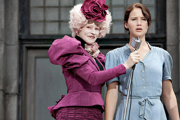
The stereotypical protagonist may purposely make themselves look in a certain way to appear strong with a strong posture and soldier like stance to make them look the stereotypical hero, they always look ready for action, they usually look quite tense and have deep stern facial features they tend to evoke respect from the audience. For example the hunger games:
Image result for katniss hunger games

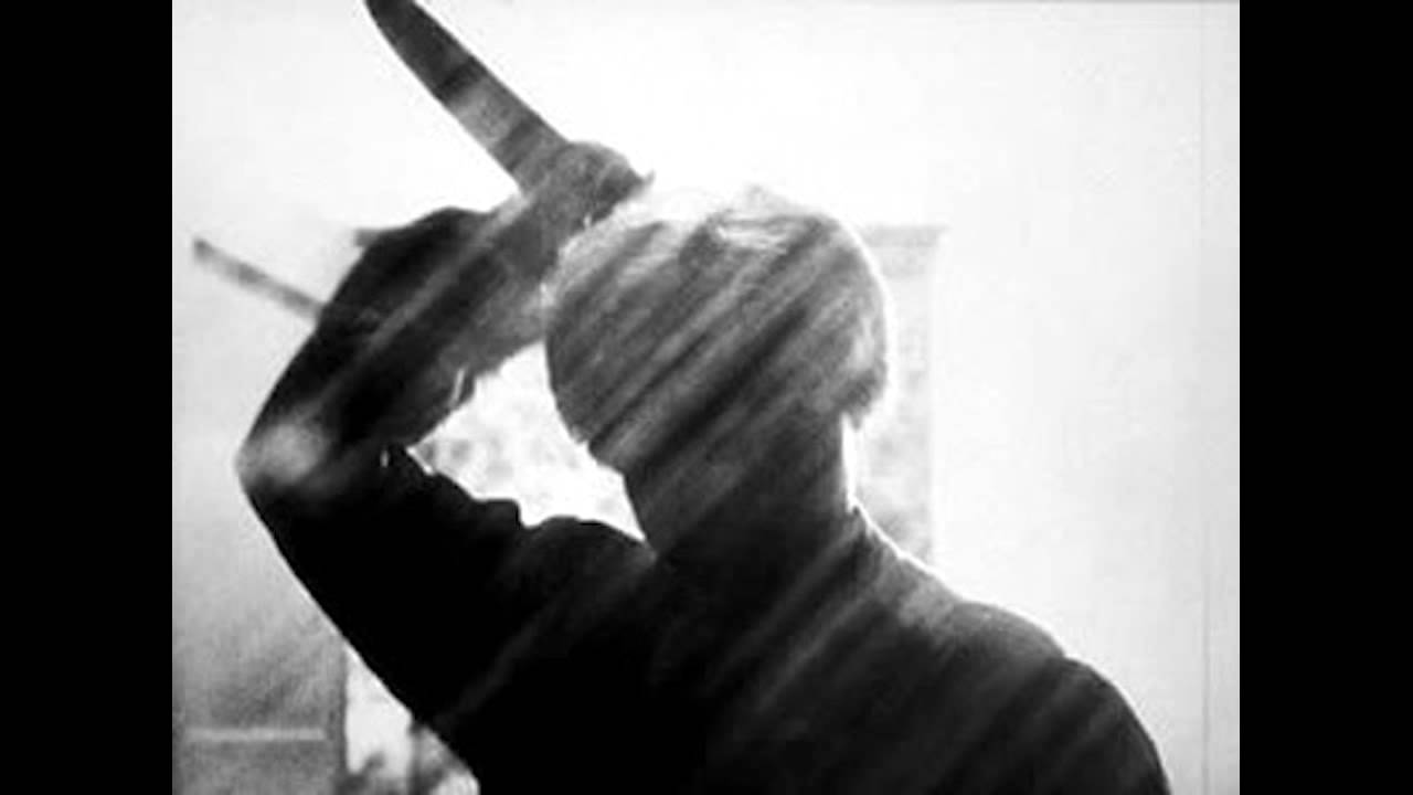
The stereotypical antagonist or villain may use body language and facial expressions to have a sort of dark presence to them which is daunting so they may have a good strong posture initially to make them appear powerful and intimidating or a slanting manner to make them look scary, shadow like and sneaky. Their facial expressions can be lifeless, or taunting with a smile to make them look evil and sadistic making the audience angry with them for causing suffering. For example the purge:
Image result for stereotypical antagonist

Thriller opening analysis:A nightmare on elm street
Related image
Here her body language is of an average posture with head slightly tilted down to make her look like a stereotypical, curious, foolish victim who wondered into the wrong place at the wrong time. Her worried facial expressions though far away indicate a cautiousness. She has no weapons or anything to defend herself with, so she appears helpless.
 Related image
In this shot you see a stereotypical villain behind her with the typically overbearing look where is head is tilted towards her with an evil gaze his posture is slanted showing a sneak attack. whereas the contrast in body language here is her arched posture making her vulnerable, and screaming facial expressions so she is the typical victim captured by the villain.

In conclusion I will use these body languages such as postures and facial expressions to portray emotion onto a character showing status as victim or villain.